 Center for Instructional Technology and Training

Minimize barriers and improve learning for all students with these five quick tips for improving the accessibility of course material.
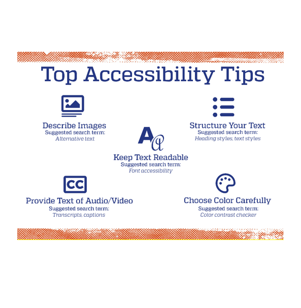
For images in written texts or presentations, summarize the content or highlight any important details. For images in digital material, include alt text, which is critical for students who use screen readers and can also be valuable for students who have a poor internet connection. (WebAIM provides a helpful guide for writing alt text.)
When using media like videos or podcasts, provide alternatives such as captions, scripts, and/or transcripts. These alternatives are crucial for students who are D/deaf or hard of hearing, and can benefit those whose study environment isn’t conducive to audio.
Intentional use of color increases readability for all learners, but careful color selection is critical for those with low vision or color blindness. First, avoid using color alone to convey meaning (color isn’t picked up by screen readers and may not be visible to students with color blindness). Second, use a color contrast checker to ensure high color contrast between the text and background or between items in complex images like a graph.
When choosing fonts for small text or large chunks of type, use simple, sans Serif fonts like Calibri or Arial. Serif fonts are more appropriate for adding visual appeal to large text like a title. For font size, aim for at least 12 pts for Word documents and 20 pts for presentations (font size may vary depending on slide dimensions).
Apply heading styles to not only promote overall readability but also allow learners who use screen readers or keyboard navigation to more easily skim and jump between sections.
Microsoft, Adobe, and Canvas all have accessibility checkers available that can identify common issues, like missing alt text or heading structure.
To learn more, check out Accessible UF as well as these UFIT workshops:
Tags: Accessibility, Student Success